How to Design Effective Signs
9th January 2018
In today’s ever-changing and competitive business world, advertising is a topmost priority for individuals and businesses who want to stay relevant. While we’re often talking about advertising and marketing online, when it comes to really grabbing people’s attention, sometimes a good, old-fashioned sign can be your best bet.
Signage is an efficient and affordable means of advertising. Just as the first impression of a person we meet may stick with us for a while regardless of other subsequent impressions, so do your business signs’ first impression stick with your customers. Signs are among the first things that customers notice, and should therefore make a good impression.
Attractive signs with bright colors, vivid graphics with simple design and readable message will make your business signage stand out among others and grab people’s attention. To ensure the successful promotion of your business and make the most of your advertising dollars, below are 5 tips to keep in mind for designing effective signs:
Keep it simple
Keep the message on signs simple and precise. An effective sign is one design in a way that viewers will quickly decipher the messages it carries in the shortest possible time. An effective business sign may only need to contain the business name, logo and little text to create awareness to potential customers. For instance, motorists have only three to five seconds to decipher a sign, making shot text messages ideal. By keeping the message short, your sign will be easier read at a glance.
When designing signage to promote your business, include only the most essential text and omit unnecessary text— excessive text will only make your sign more expensive and a less effective advertising tool. With that said, spend some time determining the message you want to convey and keep the environment in mind when creating your signage.
Make it visible and legible
Signs are typically designed to be read from afar. Thus, the text should be simplified, limited to only a few words and legible with appropriate font size and shape for easy visibility and readability. Different typefaces affect the legibility of signs. Using fancy typefaces in order to convey a certain style don’t usually make for better sign design as it may be difficult for people to read over greater viewing distances.
Using bold letters or slightly larger text also enhances the readability of signs— the larger the letter, the easier it is to read. This is especially important if want your sign to be visible from a significant viewing distance.
Leave plenty of white space
An effective sign communicates message concisely. Leaving plenty of white space – “blank area around text and images” in a sign makes it readable and eye-catching. Clustering your sign with too many text and graphics makes it harder to read and overwhelms viewers. While you may want to fill up the available area with more info as possible, leaving thirty to forty percent of the sign’s face area is ideal for optimal readability.
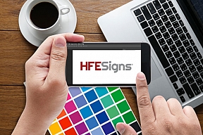
Use compelling colors
The choice of color plays a significant part in a well-designed sign. Often, color can help convey a brand’s identity. Using the right background and foreground color combo will help your signage design engaging and stand out among others.
The sign contrast also determines its readability. The contrast between colors is critical in the viewer’s retention of the content. Some color combo contrasts beautifully with each other; wrong color combination can decrease a sign’s readability. Keep your sign colors and contrast consistent to avoid a poor and less effective signage design.
Choose images carefully
Logos, artwork and other graphical elements can be added to visually enhance the design and layout of a sign. However, when creating your signage, make sure the image you choose is not only easily differentiated, but also have a clear connection to your type of business. Bonus— adding a border can increase reading speed by up to 25 percent.